

5:02 am | October 4, 2018 | Go to Source | Author:
-

Paul LukasESPN.com
The New York Jets will have new uniforms in 2019. The new designs won’t be revealed until next spring, but we didn’t want to wait that long, so we recently issued our latest Uni Watch challenge: Redesign the Jets!
Now, your friendly uniform columnist’s favorite color happens to be green, so the anticipation level at Uni Watch HQ was high. What could be better than sifting through a ton of green-centric design concepts? And the response from our readership was strong, with more than 100 people participating. But in this case, alas, quantity did not necessarily correlate with quality. While many of the submissions had some good elements — a strong logo here, a decent helmet there — it was hard to find one entry that was an improvement on what the Jets are currently wearing.
Part of this might simply be due to the strength of the Jets’ longstanding look, which has held up pretty well over the years. Also, the Jets’ entire color scheme for most of the team’s history has consisted of only green and white — an unusually limited palette — so adding any other colors to the mix, as many of our contestants tried to do, tends to be visually jarring.
Still, some entries stood out above the rest. Here’s a rundown of the best and most notable designs we received (for all of the images shown, you can click to enlarge):
Best overall design: Bob Green
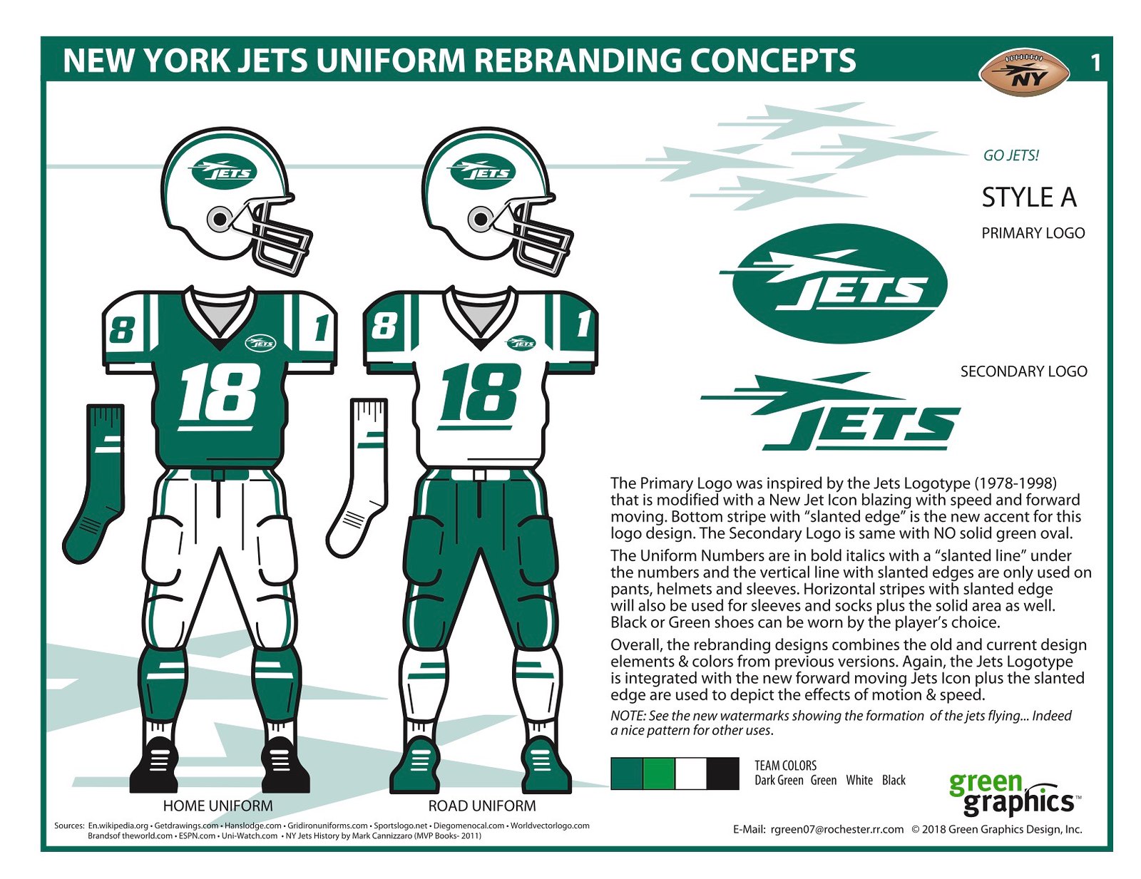
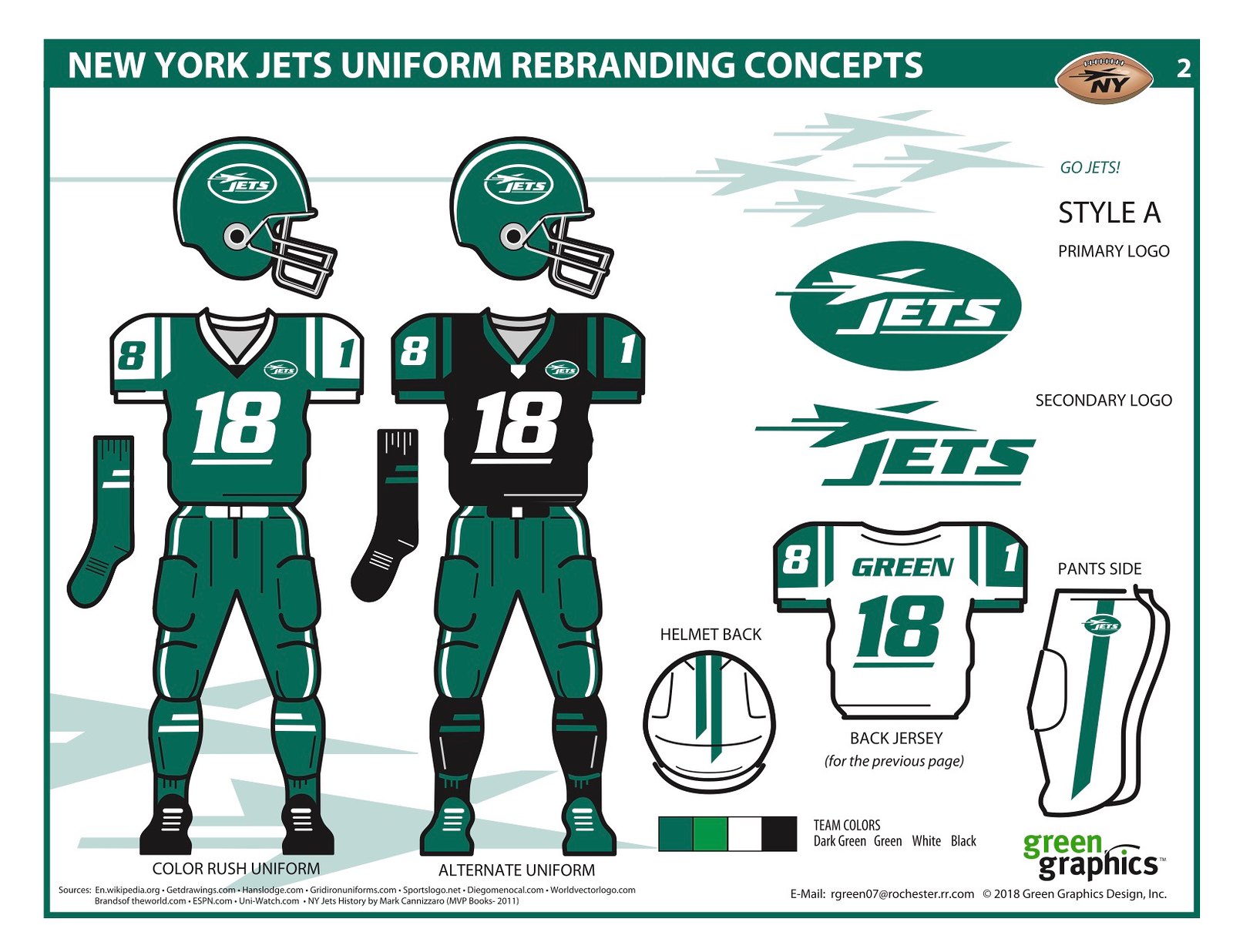
Leave it to a guy named Green to come up with a good look for Gang Green. Bob Green’s proposed wardrobe for the Jets isn’t perfect (let’s hope the real Jets never go with a black alternate uni), but it combines a solid primary logo with just enough changes to the team’s current look to qualify as modern update. Good presentation, too. Nicely done.
Best jet depiction: Hix Myrick
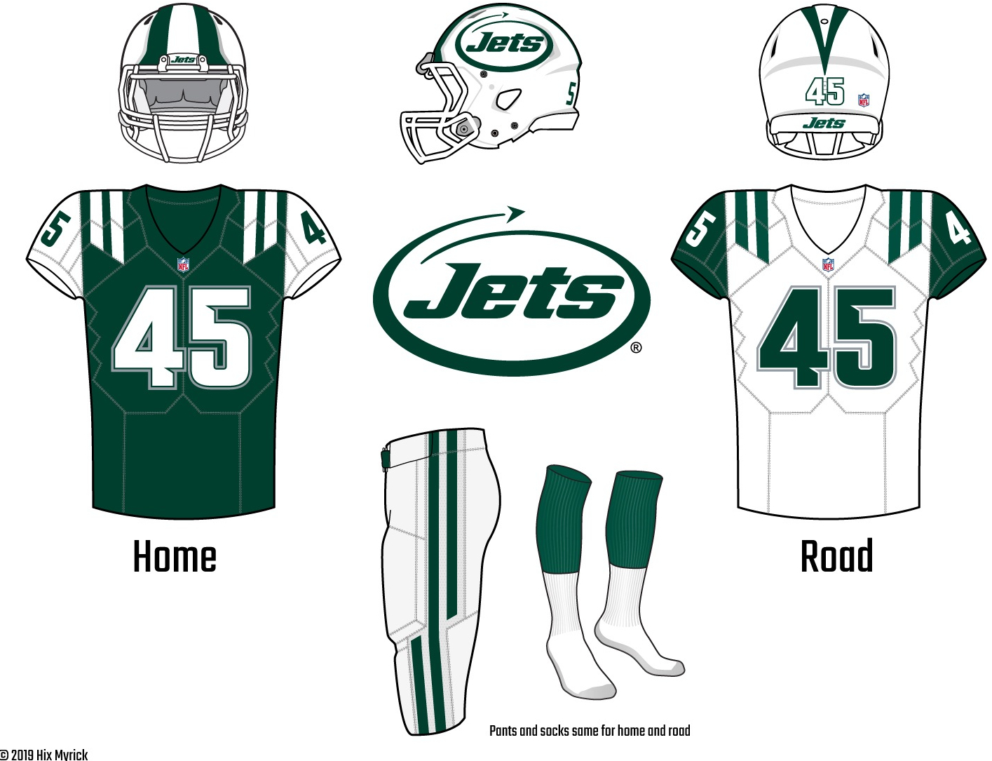
Hix Myrick’s entry has some issues (those notched cutouts in most of the letters and numbers are particularly unfortunate). But man, that little arrowhead-shaped jet leaving the oval contrail in its wake — that is perfect. The arrowhead is beautifully simple, and you could put just about anything inside that oval, and it would look totally slick. Here’s hoping the Jets go with something like this for their new logo.
Best hybrid logo: Alex Ridore
Over the past half-century, the Jets have essentially had two primary logos: the football and the speedbird. Lots of readers tried to come up with designs that referenced both logos, but Alex Ridore was the most successful. His logo feels like equal parts Broadway Joe and New York Sack Exchange. “I wanted something that looked new and modern while still feeling appropriate for an old-school franchise like the Jets, and I also wanted the redesign to feel familiar to Jets fans.” Mission accomplished.
Best presentation: Tim Fesmire
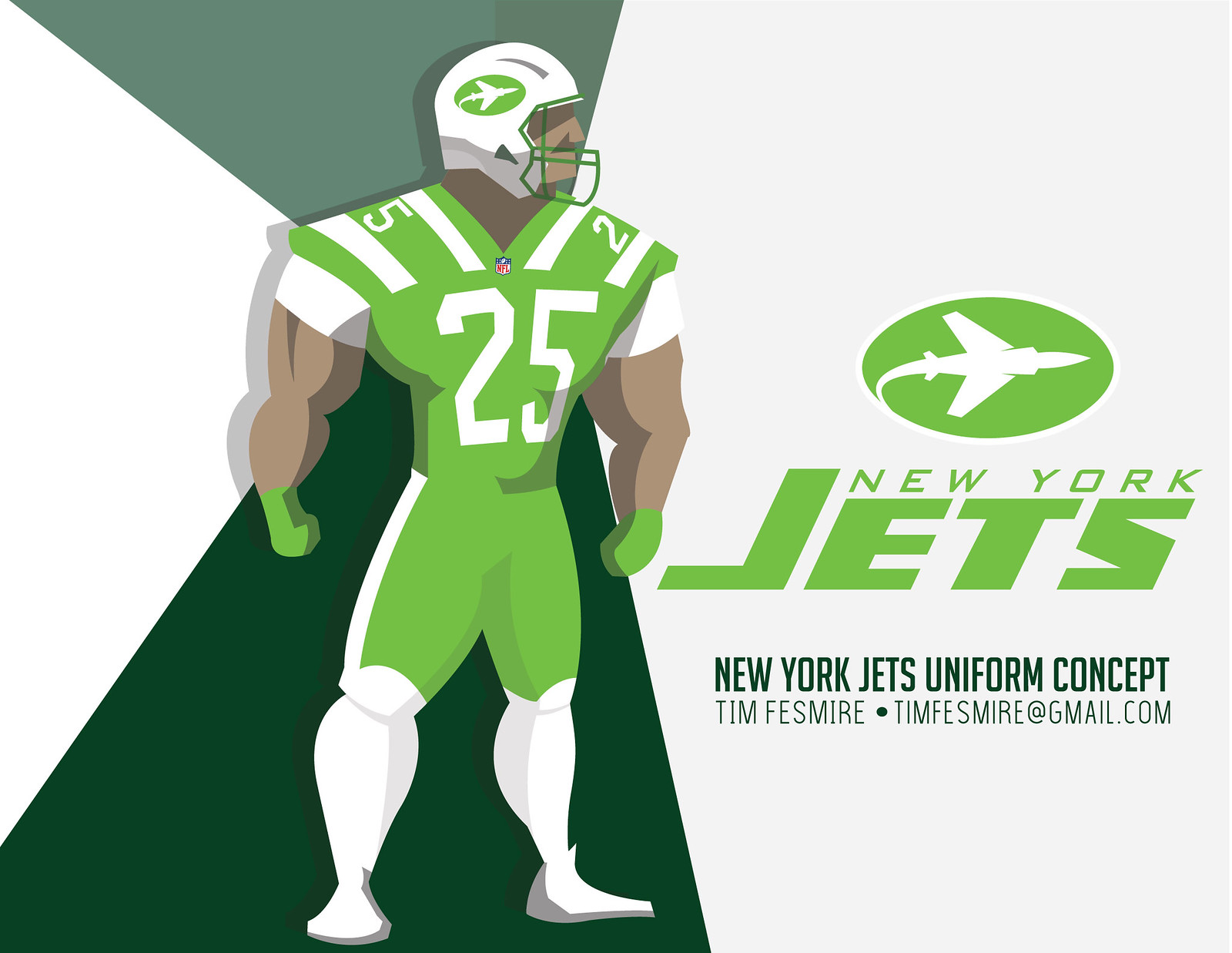

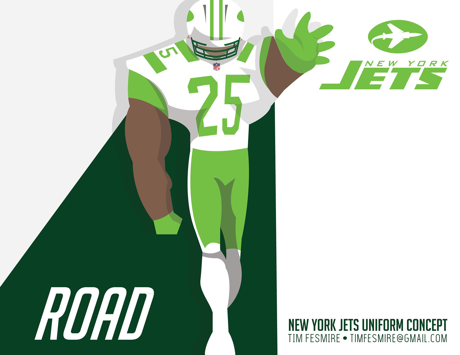

Let’s be honest: Tim Fesmire’s uniform concepts are pretty unremarkable. But he presented those concepts in a completely engaging format that looks and feels like storyboards for The Incredibles 3 (an apt comparison, since Fesmire’s Color Rush concept looks like a superhero costume). Remember, kids: Presentation counts!
Best entry for NFL fans in Winnipeg: Andrew Arena
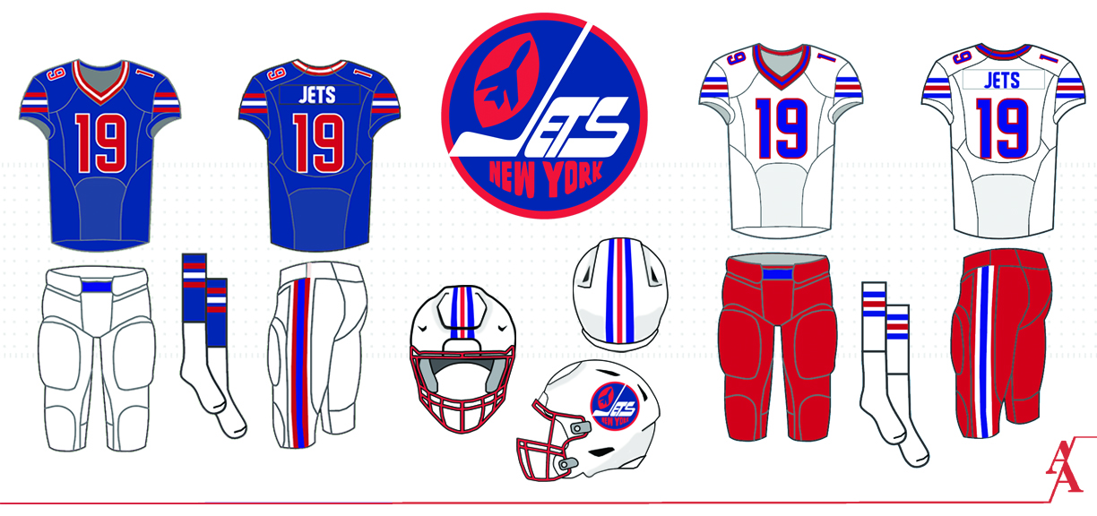
Many hockey teams over the years have been called the Winnipeg Jets. Andrew Arena is particularly fond of the uniforms worn by the Winnipeg Jets of the 1970s and ’80s, who later moved to Phoenix and became the Coyotes. Arena was disappointed when the latest version of the Winnipeg Jets, who used to be Atlanta Thrashers (are you following all of this?), opted not to use the previous Jets’ uniforms, so he decided to repurpose that design for the football field. Hey, why not? It works surprisingly well — except for the “J” shaped like a hockey stick.
Honorable mentions
• Anyone else think the inspiration for Bruce Genther’s entry might have been Sacha Baron Cohen’s “Borat” bathing suit?
• Of all the “NY”-based logos, Ian Lee was the only entrant whose proposed logo included a visual reference to New Jersey, where the team actually plays.
• Speaking of “NY” logos, Brent Hatfield had his logo’s “Y” double as a goalpost — nice! How is it possible that no New York-based football team has ever done that before?
Want to see more? You can see all of the design submissions here.
Paul Lukas enjoys paging through this Jets branding booklet, which he acquired sometime around 2004. If you like this column, you’ll probably like his Uni Watch Blog, plus you can follow him on Twitter and Facebook and sign up for his mailing list so you’ll always know when a new column has been posted. Want to learn about his Uni Watch Membership Program, check out his Uni Watch merchandise or just ask him a question? Contact him here.
Powered by WPeMatico